Colour in the kitchen is getting warmer, richer and more considered for 2027. Unlike fashion or paint, where a new colour can be embraced for a season and changed relatively easily, kitchen cabinetry is a long-term decision. That has traditionally encouraged a degree of caution. But longevity does not have to mean playing it safe when it comes to colour.
The emerging colour story for 2027 is less about one dominant shade and more about creating a palette with personality. Warm earth tones are evolving the neutral kitchen, deeper colours are being used with greater confidence, and colour is increasingly being considered alongside texture, material and light.
It is a direction reflected in wider forecasting. WGSN and Coloro named Luminous Blue as their Colour of the Year for 2027, alongside Energy Orange, Pop Pink, Meadowland Green and Clay as key colours for Spring/Summer 2027. The forecaster identifies ‘interconnectedness’ as a defining theme, bringing together nature and technology, ancient and contemporary, and grounding colours with more playful, optimistic hues.
Meanwhile, some of the first 2027 paint forecasts are pointing towards similarly nuanced colours. Behr has selected Grounded, an earthy olive green with brown undertones; Dutch Boy has chosen the earthy orange Deep Rooted; and Valspar has opted for Cottage Door, a softened grey-blue.
So what does this wider movement towards more complex colour mean for the kitchen?
The latest kitchen launches suggest many of these broader colour directions are already translating into the room itself. Schüller’s new 2027 collection, for example, introduces four new lacquer colours – almond beige, caramel, mocha and night green – alongside new smart glass finishes, natural wood effects and textured surfaces. Rather than treating colour as an isolated design decision, the collection increasingly combines tone, material, texture and light to create a more layered interior.
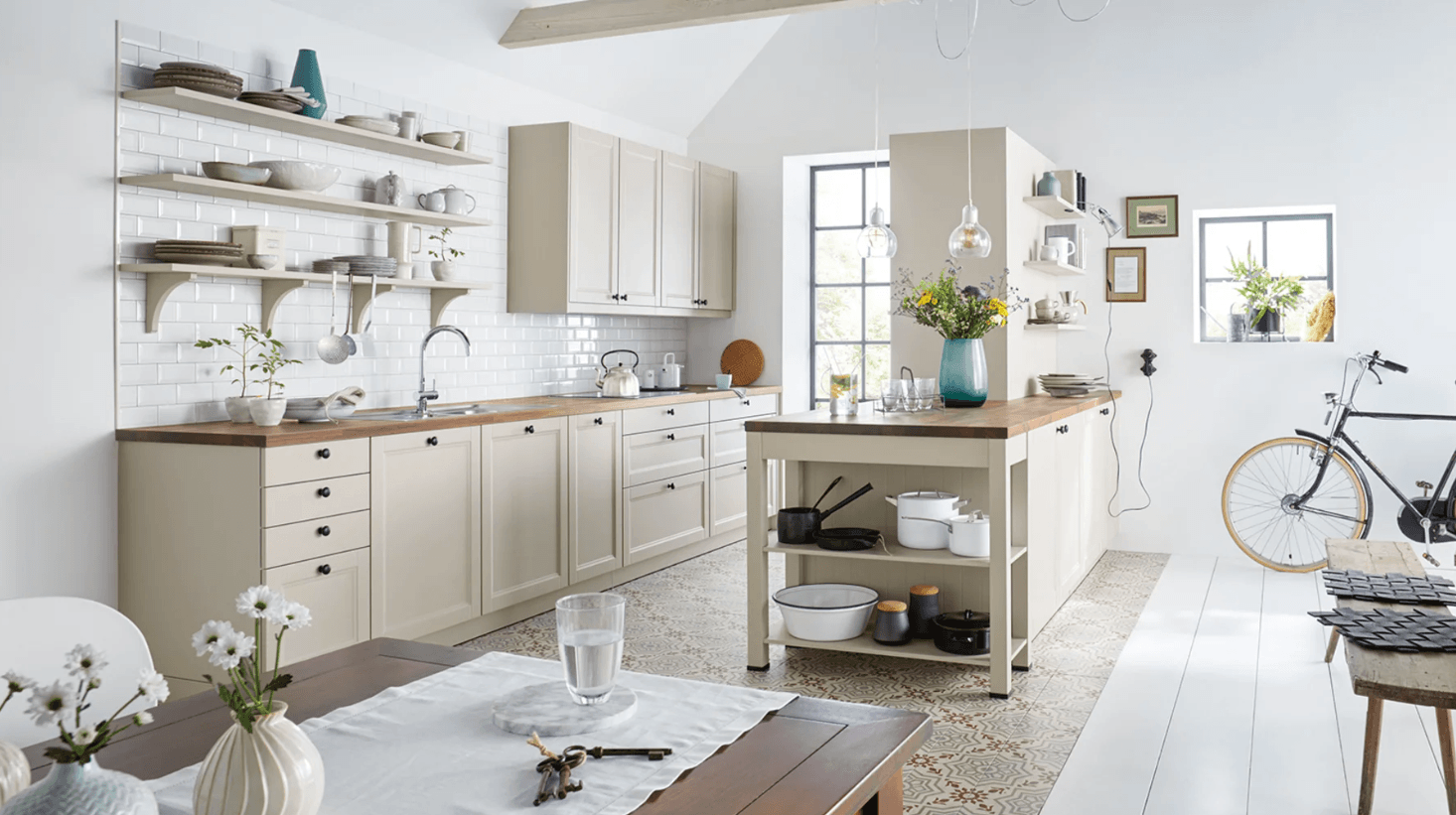
Brown is back, but perhaps not as we once knew it. For 2027, earth-inspired colours are providing a new starting point for neutral kitchens. Mushroom, taupe, clay, putty, tobacco, warm grey and soft brown sit comfortably between conventional neutrals and stronger colour, creating interiors that feel warm without becoming overpowering.
It is a direction evident in the latest kitchen collections. Among Schüller’s four new lacquer colours for 2027 are almond beige, caramel and mocha: a progression from a quiet, flexible neutral through to warmer, earthier shades.

These shades work particularly well in kitchens because of their relationship with natural materials. Timber, stone, ceramic, brass and other warm metals can sit alongside them without creating a stark contrast.
They also offer an alternative to the cool grey kitchens that have dominated previous design cycles. Rather than removing colour altogether, the new generation of neutrals has visible undertones and greater depth. The result is quieter colour rather than no colour at all.
“Neutral no longer has to mean colourless. We are seeing a much warmer interpretation emerge, with earthy browns, softened greens and natural tones creating a sense of calm while still giving the kitchen its own character. These colours also work particularly well with timber, stone and tactile surfaces, which helps create a scheme that feels considered rather than trend-led,” says Stuart Dance, Managing Director.

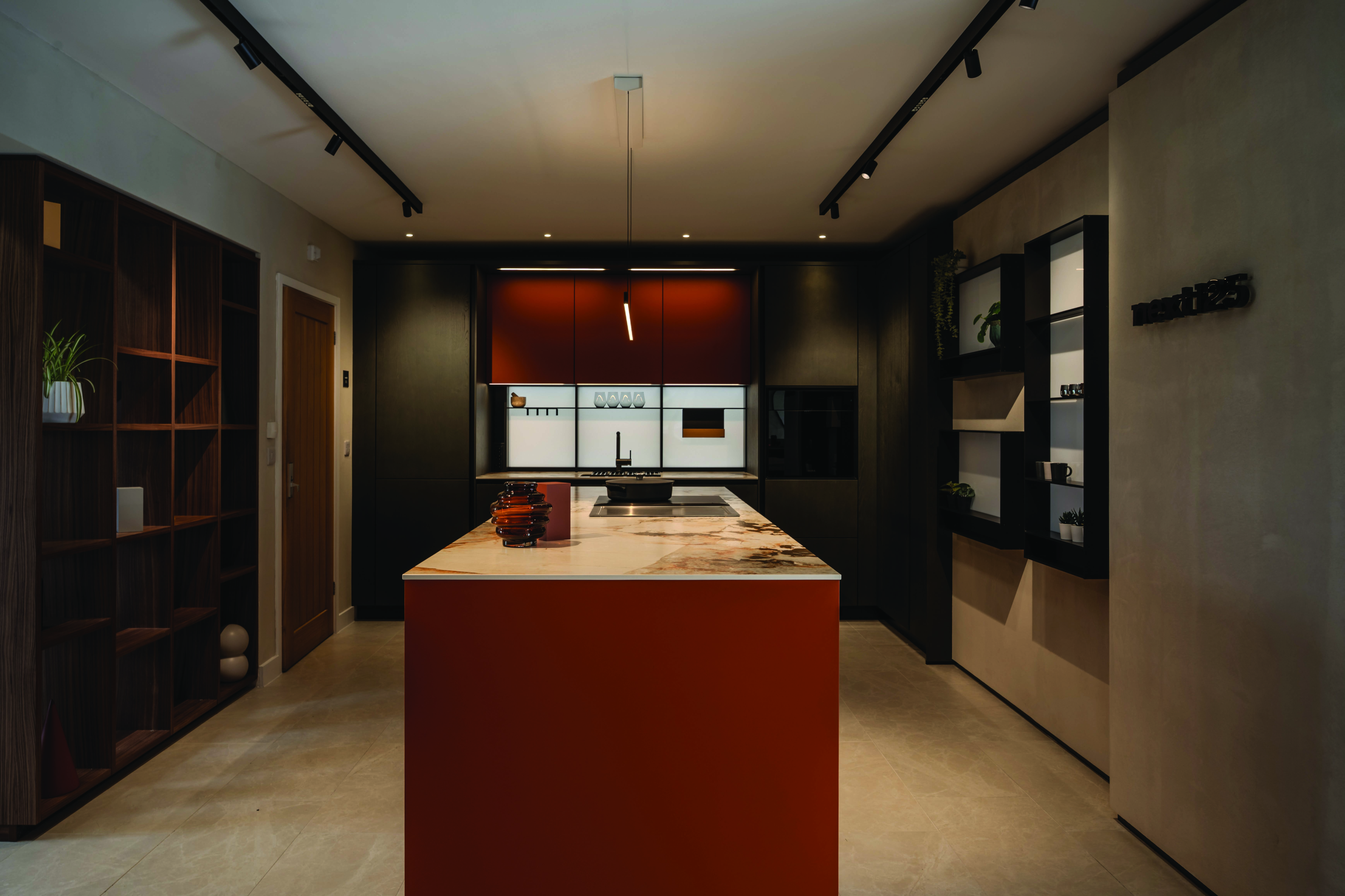
At the other end of the spectrum, 2027 is giving stronger colour the permission to take centre stage. The difference is in the tone. Instead of bright, primary shades, kitchen colour is richer and more nuanced. Think cognac and burnt orange rather than a sharp citrus; deep or mineral blues rather than straightforward navy; muted reds and dusky tones rather than brilliant scarlet.
Richer colour is also appearing in less expected materials. Schüller has introduced terracotta matt to its smart glass range for 2027, alongside mother-of-pearl matt and champagne matt. The effect demonstrates how stronger colour can be softened or intensified by the surface it is applied to rather than simply by changing the shade itself.
For the kitchen, strong colour does not necessarily mean committing every surface to the same shade. A bank of tall cabinetry, an island or a freestanding element can become the focal point of a quieter scheme.
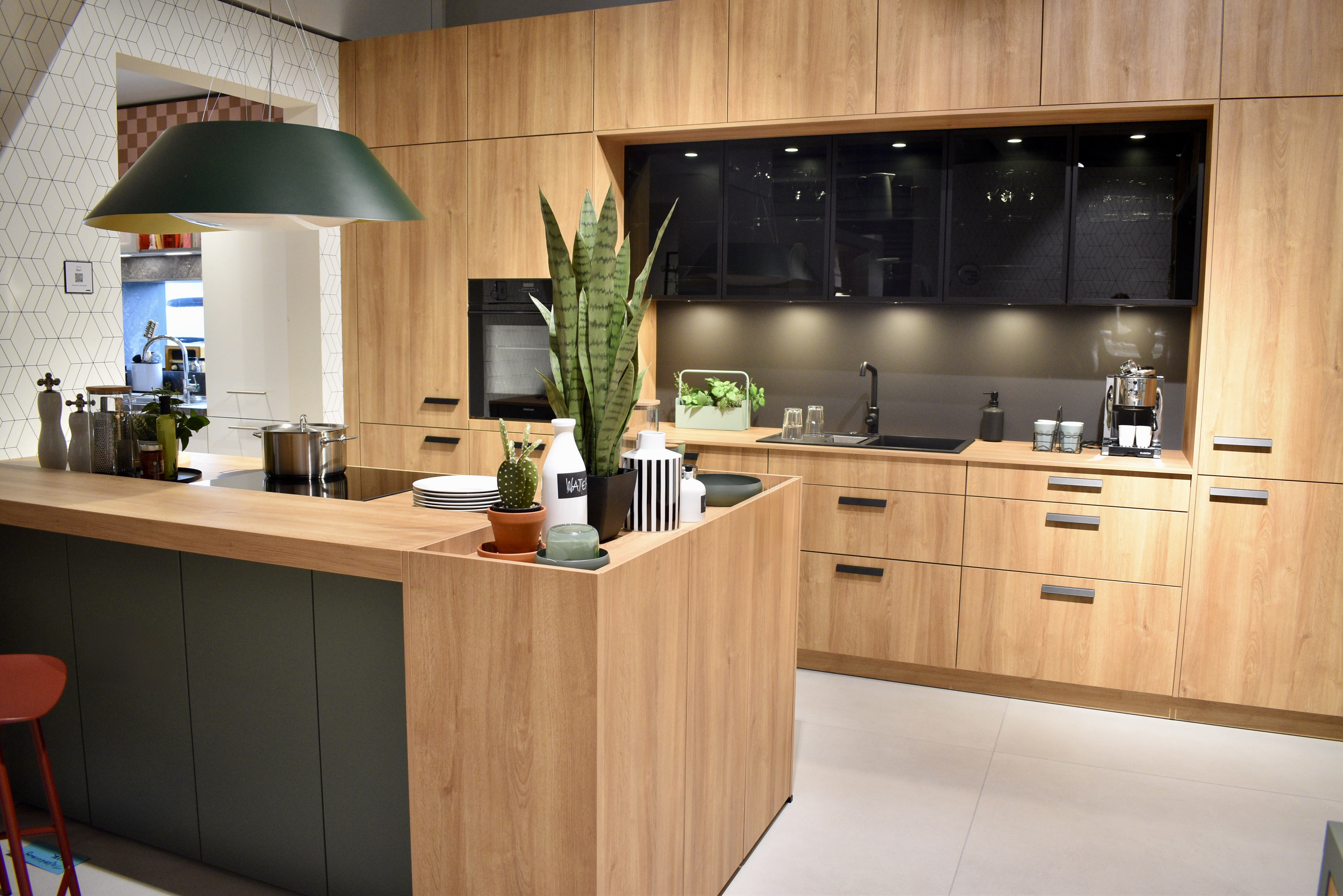
It also opens up more interesting combinations. Rich colour feels very different when positioned alongside walnut, pale oak, richly veined stone or brushed metal than it does against a plain white backdrop.
The emphasis is shifting from colour simply providing contrast to colour becoming part of the architecture of the room.


Not every kitchen is heading darker. Pale palettes remain important for spaces where the priority is openness, softness and light, but brilliant white is no longer the only route to achieving it.
Warm off-whites, chalk, sand, pale clay, stone and softened colour all create a light kitchen while introducing more character.


Almond beige brings warmth without significantly darkening a scheme, while Schüller’s new mother-of-pearl matt and champagne matt smart glass finishes offer another route to introducing subtle colour and reflectivity into a pale interior. Seashell white also features alongside almond beige and caramel on the new three-dimensional Sora front, allowing a restrained palette to gain interest through surface rather than stronger contrast.
Combining these paler tones rather than choosing one uniform finish can be particularly effective. A subtly coloured cabinet against a related wall shade, natural timber and a pale work surface gives a kitchen depth without diminishing its feeling of space. This is less about minimalism and more about subtle layering of colours and textures.
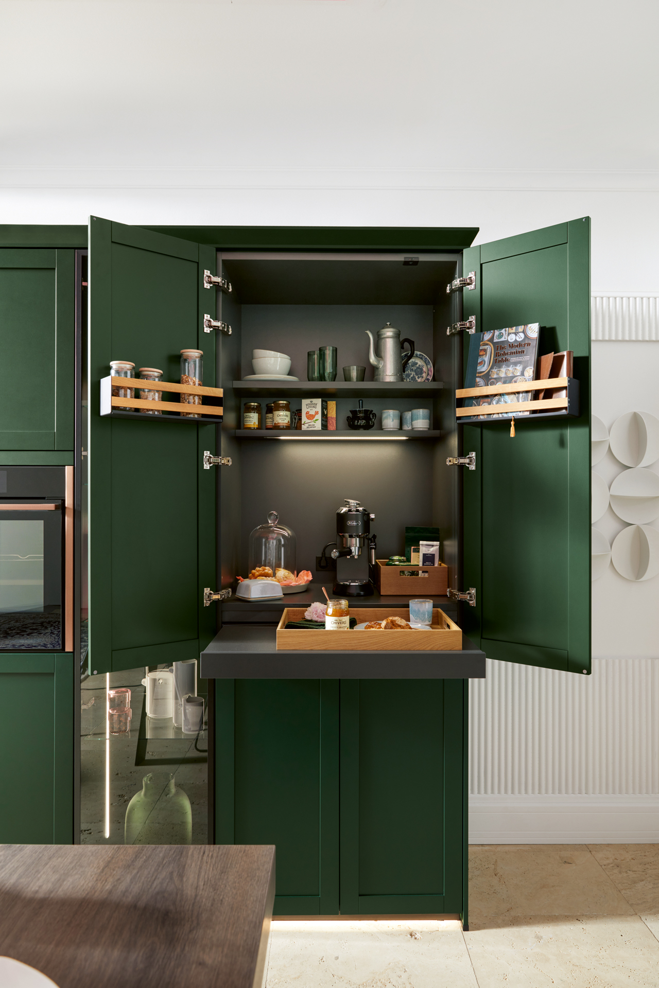
Green has become an interiors mainstay, but for 2027 it is moving beyond the pale sage shades seen extensively over recent years.
At the deeper end of the spectrum sits darker and deeper shades of green.
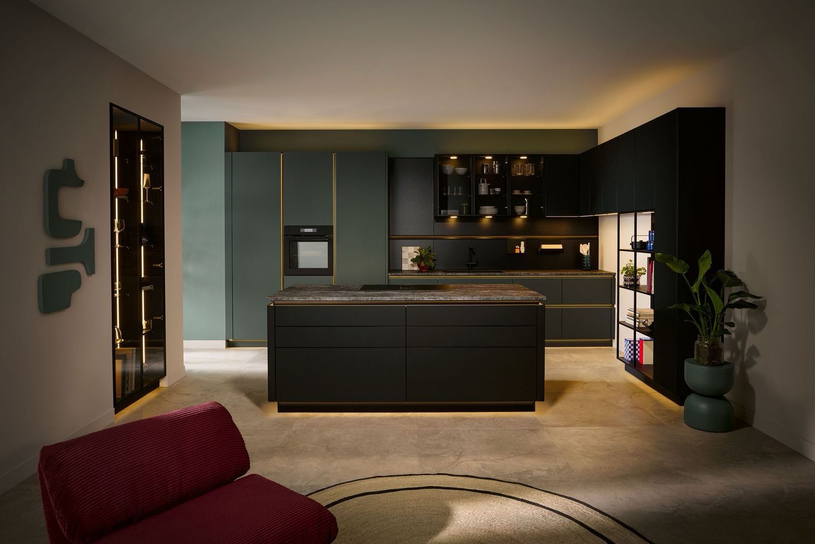
Schüller has introduced night green as one of four new lacquer colours for 2027, suggesting that the move away from softer sage is extending into more saturated, architectural greens too.
Combine a deep green with darker timber, natural stone and warm metallic details and it becomes rich and enveloping. Pair exactly the same colour with pale woods, lighter worktops and simple architectural lines and the result can feel considerably more contemporary.

One colour does not have to do all the work. Increasingly, sophisticated colour schemes are being created by layering neighbouring shades rather than combining one statement colour with a contrasting neutral.
Brown can move from cabinetry into timber and stone. A warm neutral can shift from mushroom to clay to taupe across different surfaces. Green might appear at several depths rather than as one perfectly matched shade.
This tonal approach creates variation without making a kitchen feel busy.
It also makes it easier to introduce stronger colours. An orange or rich blue becomes part of a broader palette rather than an isolated accent, particularly when related tones appear elsewhere in artwork, furniture, textiles or accessories.
For a long-term room such as the kitchen, this type of layering can be more adaptable than building the entire design around one defining colour.
“Colour is most interesting when it is considered as part of the whole composition. A shade can look completely different depending on the wood, stone, surface texture or neighbouring colour it is paired with. At next125, we look for colours that have their own identity but can also be combined in different ways. That flexibility is particularly important in a kitchen, where the design needs to feel individual today and still relevant for years to come,” says Thomas Pfister, Product Designer, next125.
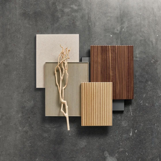
Colour is only part of what the eye sees.
The same shade can look markedly different depending on whether it is applied to a matt surface, gloss lacquer, visible woodgrain, textured laminate or ceramic finish. As a result, texture is becoming increasingly important to how colour is used.
Some of the most interesting 2027 developments deliberately combine the two. Schüller’s new Sora front has a three-dimensional texture that is both visible and tactile, offered in caramel, almond beige and seashell white. Here, restrained colour makes the relief of the surface more apparent rather than competing with it.
Natural textures are evolving too. The new five-part Prato Shaker-style front is offered in sand oak relief pore effect and the warmer Toscana walnut relief pore effect, bringing visible grain and tactility into both contemporary country and more minimalist schemes.
It is a useful principle for kitchen design too.
A monochromatic room does not have to feel flat if the surfaces respond differently to touch and light. Smooth matt cabinetry can be paired with strongly grained timber, fluted or reeded glass, stone with visible movement and tactile wall finisheswhile remaining within a relatively restricted colour palette.
Texture gives quieter colours more presence and helps stronger ones feel more sophisticated.

And then there is the element capable of changing every colour in the room: light.
A cabinet door chosen from a sample does not exist in isolation once it enters a kitchen. Its appearance will change according to the direction and intensity of natural daylight, the time of day, the surfaces around it and the artificial lighting used after dark.
This becomes especially important as colours become more nuanced. The brown undertone of an olive green may become more apparent in warm evening light. A muted blue can appear cooler in some daylight conditions. The depth of a dark matt finish can change considerably when illuminated from above, below or within neighbouring cabinetry.
Lighting design itself is also becoming considerably more sophisticated. The LumiQ lighting system now available in both Schüller and next125 collections allows its lighting elements to be continuously dimmed and adjusted from warm to neutral white, as well as combined into individually programmed lighting sequences. That degree of control means the atmosphere of a kitchen – and the way its colours and surfaces are perceived – can change between functional daytime use and a softer evening setting.
Lighting should then be planned as part of the colour scheme rather than added as an afterthought.
Perhaps the most interesting kitchen colour trend for 2027 is that there is no single answer.
The forecasts span saturated blue, earthy orange, pink, clay, green, olive and softened blue-grey. What connects them is not one particular shade but a growing appetite for colours with character and complexity. The new kitchen launches reinforce that shift. Colour is increasingly being developed not simply as a choice of cabinet finish, but as part of a wider palette encompassing wood, stone, glass, texture and light.
For a room expected to remain in place for many years, that is arguably more useful than a prescriptive ‘colour of the year’.
The direction for 2027 is towards kitchens that feel warmer, richer and more individual: grounded by natural shades, enlivened by confident colour and given depth through the combination of tone, material, texture and light.
And that may ultimately be the key to making colour last.
Researchsources
WGSN x Coloro, Colour of the Year 2027: Luminous Blue and S/S 27 Key Colours
WGSN x Coloro, Behind the scenes: How we forecast the Colour of the Year and seasonal Key Colours
Behr, 2027 Color of the Year: Grounded
Valspar, 2027 Color of the Year: Cottage Door
Dutch Boy, 2027 Color of the Year: Deep Rooted
Download our brochure+44 1434 400 070info@inhouseltd.co.ukInHouse Inspired Room Design
Bridge End Industrial Estate, Hexham, Northumberland NE46 4DQ
OPENING HOURS
9am - 5pm Mon - Fri
10am - 4pm Sat
Closed Sun
InHouse Inspired Room Design Ltd are authorised and regulated by the Financial Conduct Authority FRN 913728. We act as a credit broker and not the lender. In House Inspired Room Design Ltd registered in England & Wales with company number 04750172 VAT No. 818010953, Bridge End Industrial Estate, Hexham, NE46 4DQ.
InHouse Inspired Room Design Ltd is registered with Companies House at Bridge End Industrial Estate, Hexham, Northumberland, NE46 4DQ in England & Wales. Company Number 04750172.